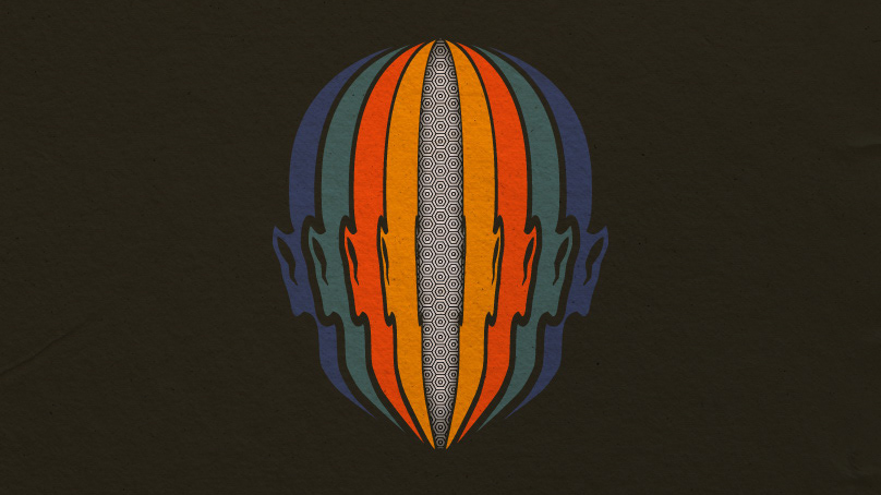
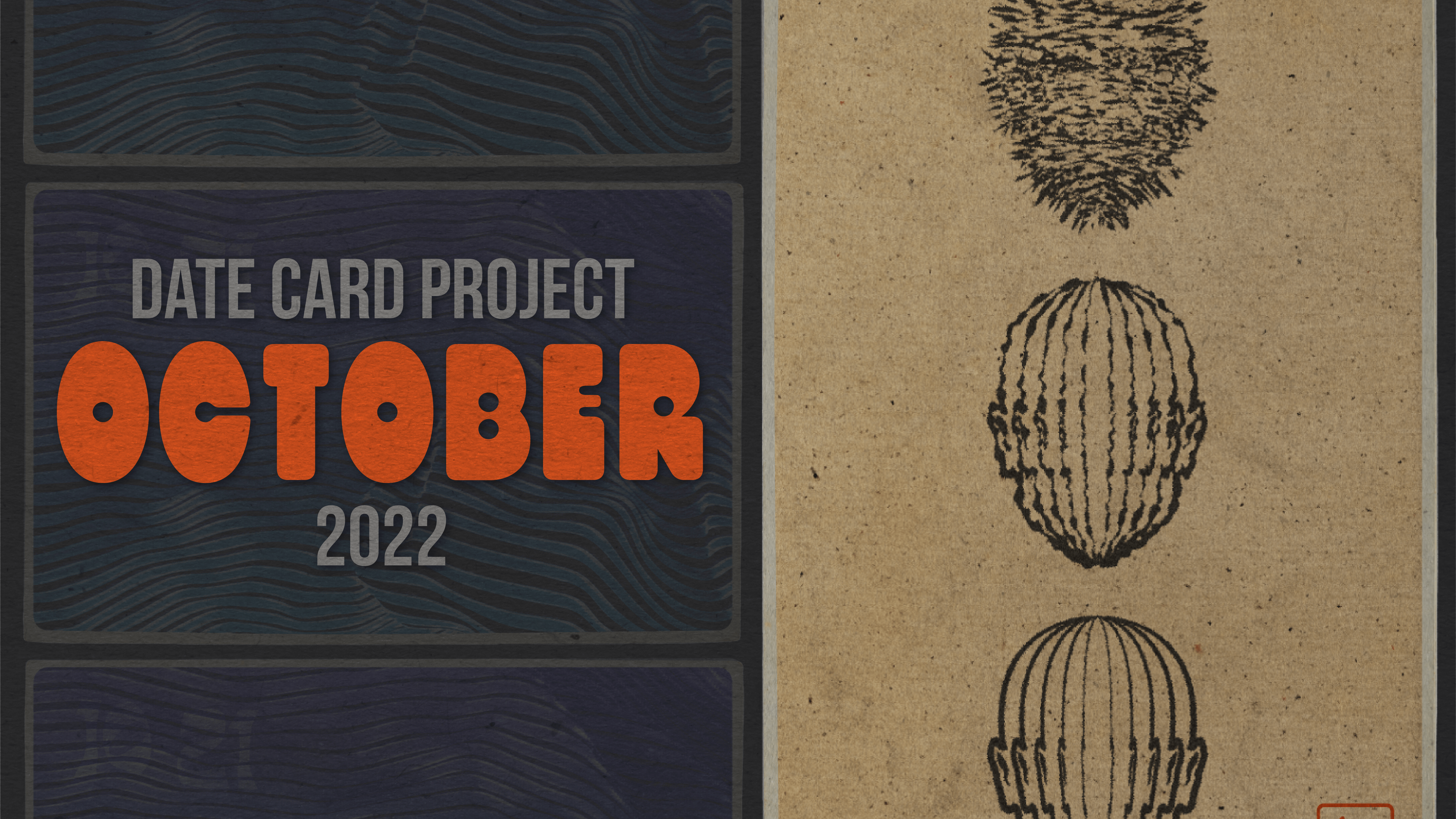
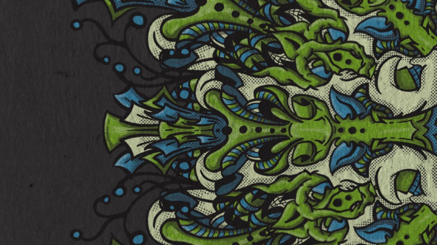
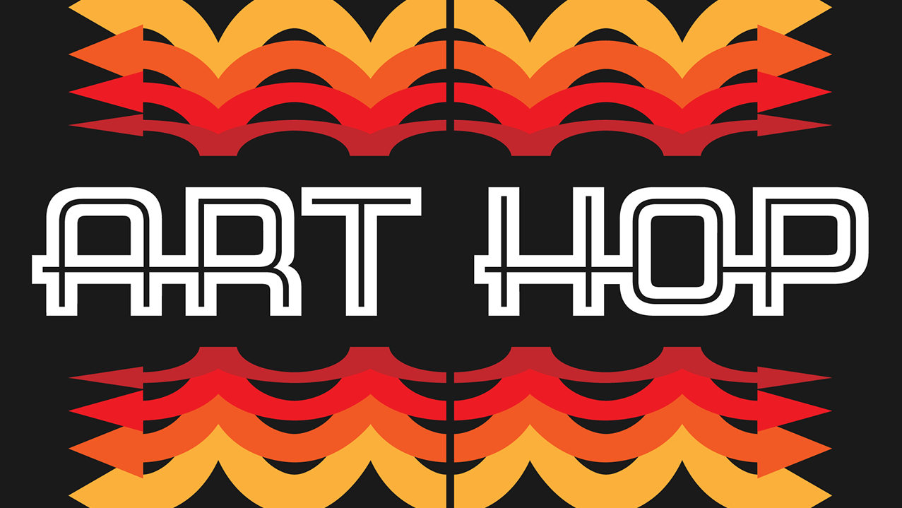
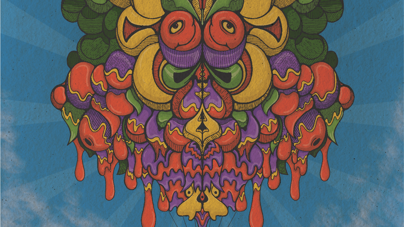
While surfing the web on a lazy afternoon I came across an amazing project of transit passes created from the 1930s - 1960s for the Milwaukee Electric Railway & Light Company. Each week their designers would release a colorful ticket stub for their transit riders. These colorful gems are great examples of color, typography and a lesson in packing information into a small space. For more info on the inspiration for this project follow this link to the Letterform Archive.
https://letterformarchive.org/news/view/milwaukee-transit-passes
Starting in February of 22, with March being the first full month of Date Cards, this project came a long way in a short period of time. I brought Photoshop into my workflow along with Adobe Illustrator and Adobe Fresco. From illustrations to typography this project touched it all. I often struggle with copy in my personal projects, so using the date is a perfect way to always have a focus. I also created a vintage card that would be used for every design. This was another way of creating uniformity within the project. These two guardrails made keeping up with a daily routine much easier.
A daily routine can lead to rapid growth and I highly recommend it for designers at any level. While this isn’t my first time doing projects like this, no matter my skill level I learn something new.
I hope you enjoy the project, I know I had fun making it. Thanks for following along.
