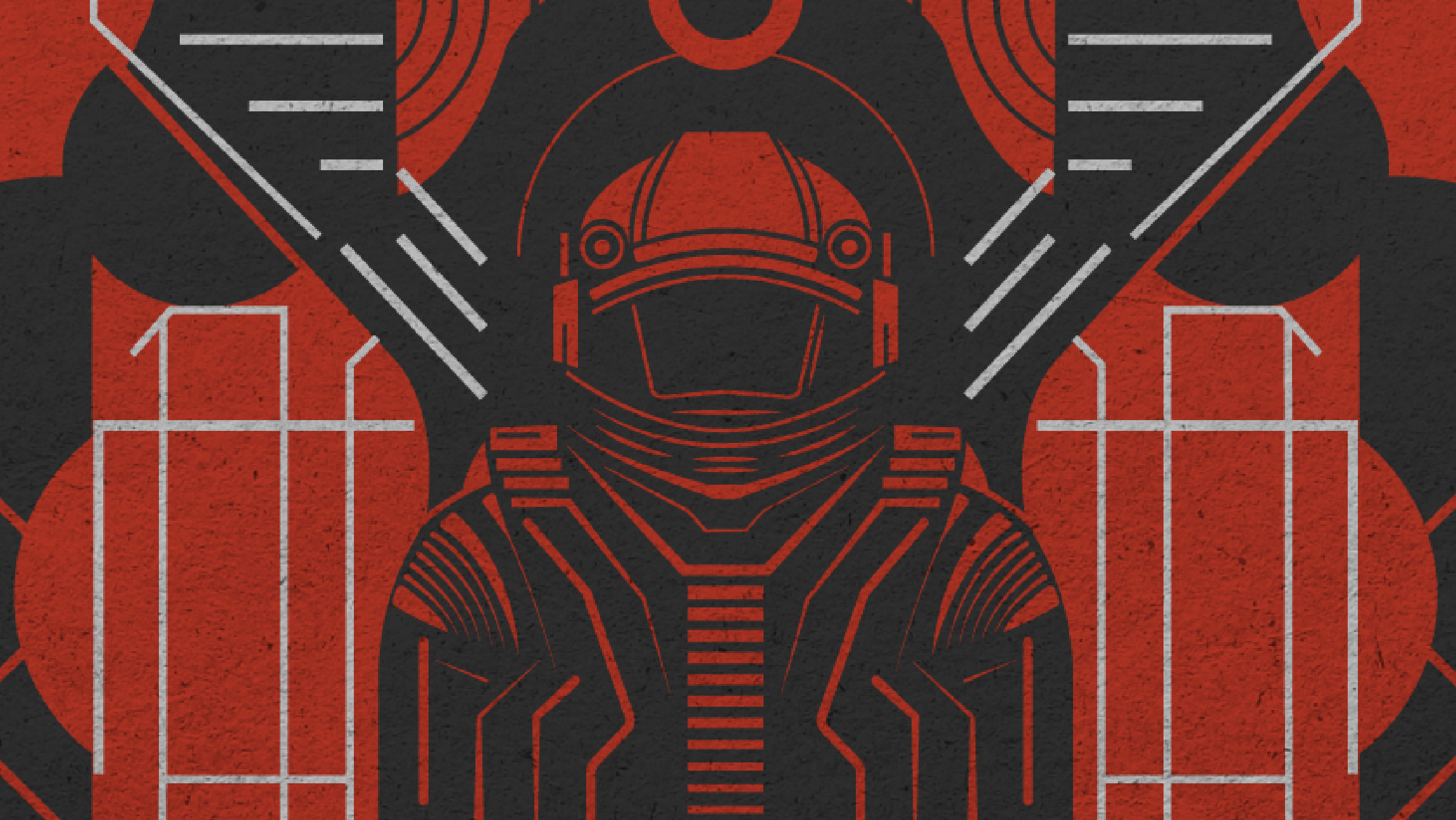
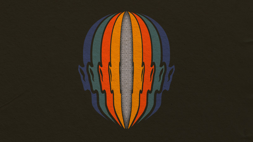
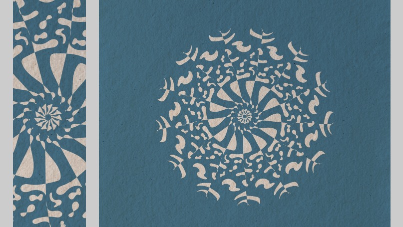
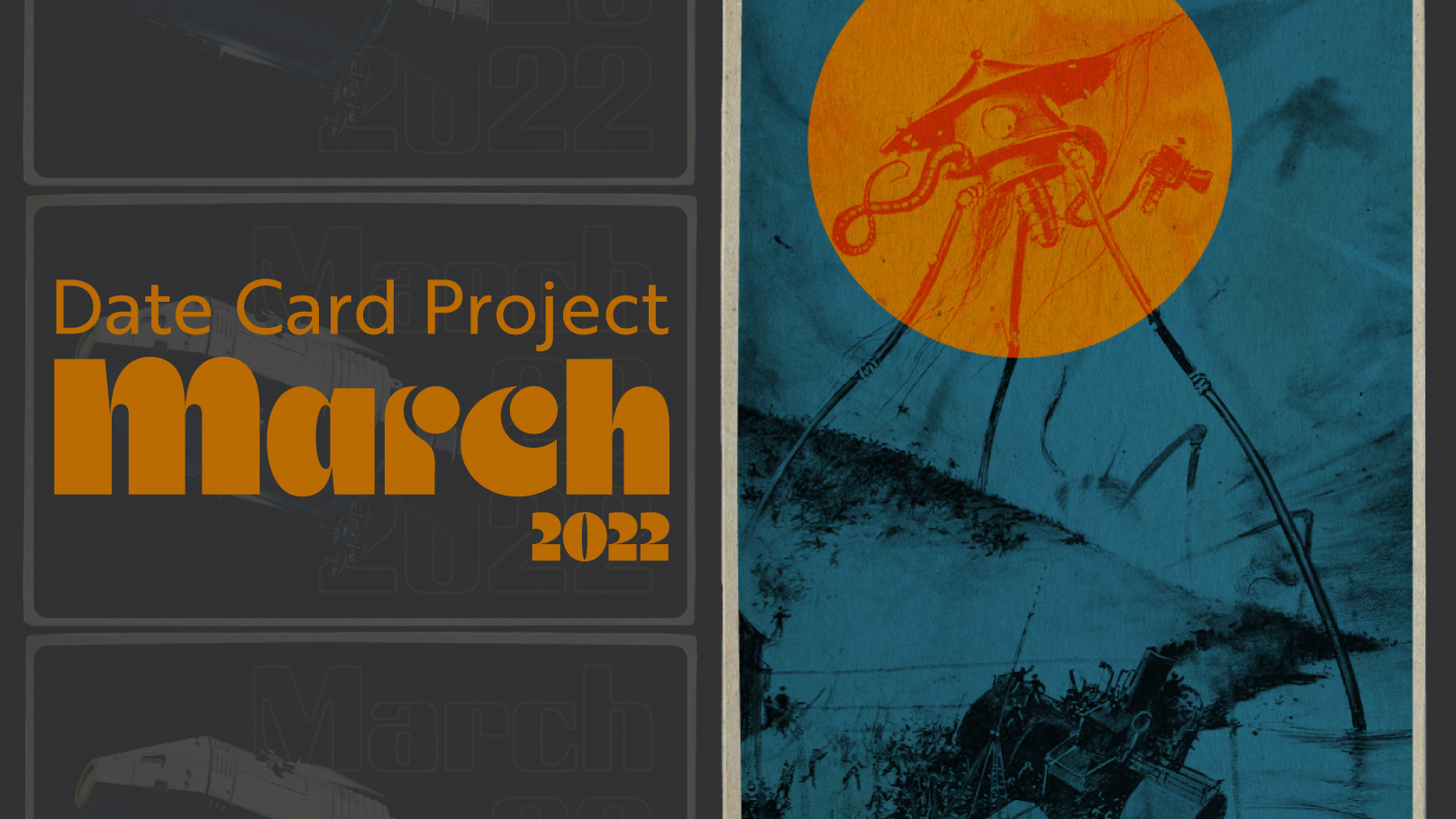
While surfing the web on a lazy afternoon I came across an amazing project of transit passes created from the 1930s - 1960s for the Milwaukee Electric Railway & Light Company. Each week their designers would release a colorful ticket stub for their transit riders. These colorful gems are great examples of color, typography and a lesson in packing information into a small space. For more info on the inspiration for this project follow this link to the Letterform Archive.
https://letterformarchive.org/news/view/milwaukee-transit-passes
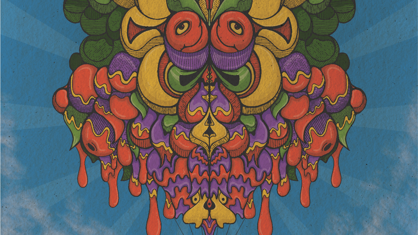
This is the second full month of this project for a total of 62 different date cards. Each with a unique theme based on the day I experienced.
This is the second full month of this project for a total of 62 different date cards. Each with a unique theme based on the day I experienced.
A daily routine can lead to rapid growth and I highly recommend it for designers at any level. While this isn’t my first time doing projects like this, no matter my skill level I learn something new.
I hope you enjoy the project, I know I had fun making it. Thanks for following along.
